When running an ecommerce store, capturing the attention of potential customers is just the first step. What happens when a visitor browses through your products but leaves without making a purchase? This is where a well-crafted browse abandonment email flow can make all the difference. In this guide, we'll walk you through the essentials of setting up an effective browse abandonment email flow to re-engage and convert those missed opportunities into valuable customers.
Understanding Browse Abandonment
Before diving into the strategies, it's crucial to grasp what browse abandonment is. Unlike cart abandonment, where a customer leaves products in their shopping cart, browse abandonment occurs when a visitor navigates through your website but leaves without adding items to their cart. This behavior signals interest, making it a prime opportunity for targeted follow-up through email.
1. Timing is Everything
The first rule of a successful browse abandonment email flow is impeccable timing. Send the email too soon, and it might come across as intrusive; send it too late, and the potential customer's interest may wane. Aim to strike the right balance by scheduling your emails within the first hour after the browsing session. This immediacy helps capitalize on the fresh memory of the products viewed.
2. Crafting a Compelling Subject Line
The subject line is your email's first impression, and it needs to be attention-grabbing. Incorporate personalized elements such as the product name or category to remind the recipient about their specific interests. Consider a sense of urgency or exclusivity to entice them to open the email promptly.
3. Dynamic and Personalized Content
The heart of any browse abandonment email is its content. Leverage dynamic content to showcase the exact products the user viewed. Include high-quality images, product descriptions, and, if applicable, any discounts or promotions. Personalization is key here – address the customer by their name and tailor the content to their preferences.

4. Clear Call-to-Action (CTA)
Your email's purpose is to guide the recipient back to their abandoned browsing session. A clear and prominent CTA is vital for this. Use persuasive language and design to encourage clicks. Whether it's "Return to Your Favorites" or "Complete Your Look," make it enticing and straightforward.
5. Incorporate Social Proof
Reassure the potential customer about the quality and popularity of the products they viewed by including social proof. This can be in the form of customer reviews, ratings, or testimonials. Knowing that others have found value in these products can sway their decision positively.
6. Optimize for Mobile Responsiveness
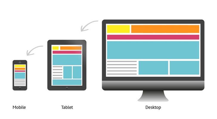
Given the prevalence of mobile browsing, ensure your browse abandonment emails are optimized for various devices. A seamless mobile experience increases the likelihood of engagement and conversion. Test your emails on different devices and email clients to guarantee a consistent and visually appealing presentation.

7. A/B Testing for Continuous Improvement
Don't settle for the first version of your browse abandonment email. Implement A/B testing to experiment with different subject lines, content layouts, CTAs, and even sending times. Analyze the performance metrics to identify what resonates best with your audience and refine your approach accordingly.
8. Frequency and Gradual Escalation
Consider the frequency of your browse abandonment emails. Start with a gentle reminder in the first email, followed by a more persuasive offer or additional information in subsequent emails. However, be cautious not to overwhelm the recipient with too many emails, as this could lead to unsubscribes.
9. Compliance with Privacy Regulations
Always ensure that your browse abandonment email flow complies with privacy regulations such as GDPR or CAN-SPAM. Obtain explicit consent from users before sending marketing emails and provide a clear and easy way for them to opt-out if they choose to do so.
Conclusion
A well-structured browse abandonment email flow is an essential tool in your ecommerce collection. By understanding your audience, optimizing content, and employing strategic timing, you can turn potential customers into loyal patrons. Continuously analyze the performance of your browse abandonment emails, incorporating feedback and insights to refine your strategy and create a seamless and effective customer re-engagement experience.
Want to supercharge your abandon cart revenue? Get in touch here.


